Most museums are located in old buildings, and some are in new purpose-built buidings. Both types have problems.
Old Museum Buildings
Here are a couple of examples, one from the “New World” and one from the “Old World”.
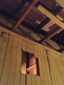
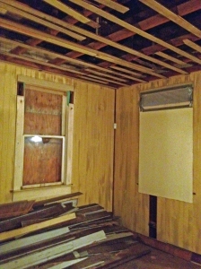
New World – A museum in an old fishing village in Canada
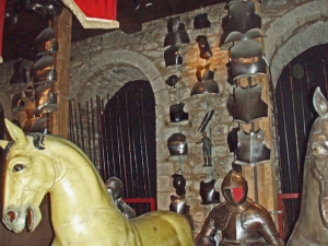
Old World – The White Tower at the Tower of London in England.
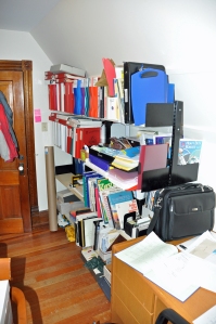
Most museums have to make-do with old buildings that are cramped, dark, leaky, have windows everywhere, have asbestos insulation and basements that flood. Many have old bank vaults as storage for small valuables. These may be old heritage buildings but they are often inappropriate for use as museums. Most Curators dream of having a purpose-built new museum.
So, money has been found to pay for a new building. A committee has been formed and an architect has been selected. Perhaps a consultant walks the committee through a process for assessing the functions of the museum in the new building. Public and staff only zones. Circles connecting functions. Traffic flow. Of course, today everyone wants LEED certified for environmental controls to protect the collection and environmentally responsible.
I was involved in moving a museum into a brand new museum building that had been designed and built with no museum staff input and before I was hired as the Curator. At another museum I was involved in planning an administration building which would house all of the offices, workshop, changing rooms for costumes, washrooms, archives and artifact storage. I was Acting Director when we moved into it. Later as Curator I was involved on the sidelines of designing a carousel pavilion. I had some involvement in the planning of a new tram barn for a restored tram-car (like a streetcar, only larger). At the end of my career I was again involved in the design of a museum and archives in a city civic centre, but as Museum Manager was sidelined by senior management most of the time.
I do not hate architects, and indeed a good friend is an architect, but they do need to be monitored. Very few of us would hire an architect to build our “dream house” and not be involved in the process, reviewing plans etc. as the process goes along. If we did not, we might end up with an ultra-modern house for example when we really love the old Victorian look, with three bedrooms when we have nine kids. Even Frank Lloyd Wright had customers who specified what they wanted.
What could possibly go wrong? 😉
LEFT: Front entrance of the British Museum in London; RIGHT: WWI aircraft inside WWI hanger at RAF Museum in Hendon.
MISTAKE #1 – You could have an architect who is an egotist. At a military museums’ conference in the 1970s, the Royal Air Force Museum Director told us the story of planning the new RAF Museum buildings at Hendon, North of London, England. A nationwide competition called for architectural concept submissions. The one requirement stipulated was that the two original World War I aircraft hangers be preserved and incorporated into the design. In spite of this, all of the design proposals started with a conceptual bulldozer levelling the two hangers! The Director met with one famous British architect who had made a submission. Looking at the drawing, the Director commented that there were steps leading up to a door, set between classical pillars, looking much like the British Museum in London and that he would not even be able to get his aircraft into the museum! The architect replied “My dear chap, they will not be coming to see YOUR aeroplanes, they will be coming to see MY building!” “No, they won’t” said the Director, “because I refuse to build it!” Later the Director met with a Canadian architect at the site and described what he wanted. The Canadian architect pulled out a cigarette pack, pushed it open to expose a blank surface and made a quick sketch saying “Something like this?” The Director said “Yes.” They built an excellent museum.
Two photos that I took in the RAF Museum at Hendon. LEFT: B-17 bomber with jeep and mannequins; RIGHT: Vulcan nuclear bomber with dummy bomb load laid out and mannequins of an RAF Policeman and his guard dog.
A famous architect in Canada builds with artistic curved walls. This led to a huge waste of space in a national museum. The shelving was in straight runs and the walls were curved. Remember that you are paying for every square foot (or square metre) of space. This same architect raised a legal battle when the congregation of a church that he had designed, wanted to add a large room on the side to meet their needs. The architect fought against this in court I believe as it would “ruin” HIS design. How naive the minister and congregation were to think that it was THEIR building just because they had paid for it! (Yes this is meant to be sarcastic.)
MISTAKE # 2 – Leaving the museum Curator and others out of the planning.
One of the biggest mistakes is to exclude trained and experienced museum staff. At one museum I was Curator at, they designed a building for a vintage carousel. As the Curator, I was excluded from most of the planning!
- The roof ended up as a bathtub to trap the water – this in a rainy climate. I have a saying that “water is smarter than architects.” Common sense says to get water and snow off of a building as fast as possible to prevent damage, but an amazing number of architects seem to be unaware of this simple fact and build flat roof or rooves with a water catchment area.
- When I was finally shown the semi-final plans for the building, I looked at it for a couple of minutes and then asked “How are you going to get the carousel INTO the building?” I suggested a large glass lift-up wall, similar to a modern garage door, so that forklifts could move the heavy parts of the carousel in and out of the building as required. Naturally they did not listen. When it came time to install the carousel, the largest part, the centre pole with the large circular electrical contact wheel on it, was brought in through a double side door with a clearance of about 1 inch on each side. So I was told, as I was on late shift that day!
- The basement of the building was to be for storage of vintage automobiles and wagons. The contractors installed a huge air duct across the middle of the room! It cost thousands of dollars to reroute it. That error could be fixed. At another museum, while I was away for three-day giving a workshop, my boss allocated where the museum functions would go in the new civic centre, with no input from the Curator . Storage was placed on the 4th floor, and they later discovered that the floor would not support the weight, and air ducts filled a lot of the space, so the storage is about half of what was planned for. A related problem was the elevator to move artifacts in and out of the building and between storage on the fourth floor and the galleries on the third floor. This same boss wanted a small passenger only elevator for budget reasons, but I insisted we needed a freight elevator, for obvious reasons!
MISTAKE #3 – Not carefully reading architectural plans and not staying on top of the situation
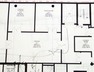
An early version of a museum floor-plan showing the back workshop area. The staff sketched traffic flows and the plan went through many versions. It is easier and a heck of a lot cheaper, to move walls, doors and windows on a plan that after is has been built! It is something like a marriage, so “speak now or forever hold your peace!”
By the time that the first draft plans have been drawn up by the architect, staff tend to become giddy with the thought of a NEW museum building! They had given their specifications to the architect and everything is starting to look good. They can hardly wait!
- Space – The first pages in the architectural plans of your building usually show nice big, empty rooms. By all means look at these, but do turn to the electrical and mechanical drawings at the back. You will be in for some big surprises. That wall where you planned to place your file cabinets has electrical outlets, thermostat etc. Drain pipes and toilet pipes drain through your museum and archival storage areas. Heating ducts eat up space that you thought you had. At one museum, the storage room for dead office files, folding tables and chairs turned out to have a huge duct running across the floor, thus the carts with tables and chairs had to stay on one side and dead file boxes hand to be manhandled over it. This was after you had ducked under another huge air duct that was about 4-1/2 feet off the floor. It is well worth asking lots of questions and learning how to rear electrical, mechanical and other plans.
- Water Pipes – I met with an architect and insisted that I wanted NO water pipes in the new museum and archives storage rooms in the basement. She put ALL of the water pipes for the building through the museum artifact storage! All the pipes to the outside taps (hose bibs), all the toilet drains, and even the main water supply to the building. As damage control I insisted on drip pans under all pipes and water sensors for flooding alarm (simple two prong probes where water connecting the two would complete a current and thus signal a flood.) The main water supply was a pipe about 5 inches in diameter and one day I noticed that the inner pipe sleeve was sliding out of the outer sleeve at a joint. The water pressure was pushing it apart. Brackets were installed to secure it. If it had burst, we would have had a huge flood. The ideal in my mind would be to have all kitchens and washrooms and other functions requiring water housed in a tower, one above the other. Then the water pipes go vertically and can be contained in a shaft, with sump pumps etc. When planning a museum building, do not be surprised when the care of the collection takes second place to the placement upstairs of washrooms, sinks, sprinkler feed pipes etc. A washroom or kitchen sink for staff and volunteers is more important in many senior staff minds than artifact of archival storage as I wound out several times.
- Doors etc. – Watch for odd doors, low ceilings, pillars etc. At my last museum there was a corridor we planned to use to bring an 1870s stagecoach and Ford car through. One day I noticed on a new set of plans that some pillars had been moved about a foot into the corridor on both sides. This would have prevented us from moving the vehicles in and out. The ever helpful architect told me we could move the vehicles up the staircase and into the gallery! I shall not repeat my response to this idiotic idea which would put staff, artifacts and indeed the building, at risk.
- On the same project I counted about 8 rooms with no doors. With the new computerized drawings, it is easy for errors to creep in. My favourite was what I christened the “Harry Potter Door”. In the Harry Potter movies, the children have to magically pass through a solid wall in order to get to the magical train platform. The architect approached me and said that for structural strength he needed to put in a concrete wall about 2/3 of the way across my archival storage room. He was surprised when I readily agreed (Curators CAN be co-operative in a win-win situation) and simply asked for him to put in a double door to complete the wall across, thus giving me an inner sanctum storage room for City Council minutes etc. The double door would enable a cart with map file boxes to pass through with the boxes kept level. On the next set of drawing the door was there but the drawing showed that it opened to a solid concrete wall. Even if one passed magically through this like Harry Potter and friends, there was a concrete pillar about two feet in front of the doorway, dead centre! Happily they did make a door cut-out in the concrete wall and moved the pillar during construction. During construction of an administration building we had a hard-hat tour to see the progress. I noticed a workman entering and exiting a future washroom by slipping in between the 2×4 studs. I asked him “Aren’t you going to put a door into this room?” He looked around and realized that they had framed it without a doorway.
- Windows – These are a huge problem. Architects seem to design buildings from the outside in and they love windows. I am still flabbergasted that the Library and Archives Canada new storage facility for the national archives of Canada is a GLASS building! Staff have a professional duty to be heard. If you were building a new house for your family, would you simply give the architect a few guidelines and then return a year later to move in? In our case I was told that we would have a long-term display gallery of 5,000 square feet. I said fine, I just want it to be a “black box” so that I can control light, access, etc. Then an office tower was added into the mix and the architect wanted to carry their glass wall all the way to ground level, slicing through the side of the museum gallery. I knew I could not win that battle so I said that I would build wooden walls inside to blank out the windows. My boss vetoed it. These windows face West and anyone who has lived in an apartment building knows what the result is – a hot box! My boss insisted upon a sunny room so doors had to be installed between it and the gallery housing the artifacts. No artifacts can safely be displayed in this wasted space other than those made of cast iron perhaps. Another city museum had windows along ALL of the galleries. Staff painted them black but found that this built up the heat from the sunlight and the widows started cracking. They ten went to white.
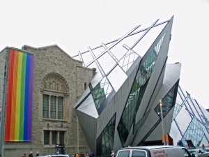
- Wasted Space – Anyone who has worked in museums knows that you NEVER have enough space in storage or in galleries. Every square foot of a new building costs you a lot of money, so why do so many museums allow architects to plan huge empty spaces? The Canadian War Museum and the Royal Ontario Museum are examples that I have seen.
Royal Ontario Museum ‘s stupid (remember this is MY web site, not theirs 😉 “The crystal” ultra-modern expansion of an old building. Inside is a lot of wasted space. Ironically this modern expansion houses their dinosaurs’ skeletons which are millions of years old.

